The latest news from Meantime IT
All Meantime newsMeantime goes responsive
If you read our newsletter, you may be familiar with our enthusiasm for responsive design. In our November issue, we introduced you to our new website and the accompanying feature explained why we're so excited about this new way of designing websites.
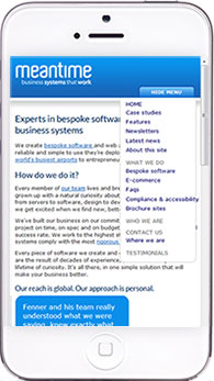 As we practise what we preach, we spent a lot of time ensuring our own website was in full responsive working order before going public. It's a good job too, as many of our regular readers contacted us to tell us they'd checked. Happily, no one found any problems!
Designer Lou took our existing site and introduced a new style sheet (the instructions that web browsers interpret when displaying a site) which targets the various media devices people use to view the web.
Now, if you look at our website on any device from a smartphone to a large-screen Mac, you'll be able to view the site easily and comfortably without the need for fidgety scrolling.
Our client support area incorporates every element of the responsive design too, so when our clients log in to add change requests or to check on progress, it won't matter what device they're using.
If you're not familiar with how websites work, you might find this news a bit, 'whatever'. We don't mind that at all. We're just happy in the knowledge that if you're reading this on our website, it looks good.
Because everything we build is bespoke, you might not see exactly what you need. If that’s the case please get in touch. We'd be happy to discuss how we can help you to take the first step to cutting costs and growing beyond all expectations.